项目github地址:bitcarmanlee easy-algorithm-interview-and-practice
欢迎大家star,留言,一起学习进步
1.正态分布简介
正态分布(normal distribtution)又叫做高斯分布(Gaussian distribution),是一个非常重要也非常常见的连续概率分布。正态分布大家也都非常熟悉,下面做一些简单的介绍。
假设随机变量
X
XX服从一个位置参数为
μ
\muμ、尺度参数为
σ
\sigmaσ的正态分布,则可以记为:
X
∼
N
(
μ
,
σ
2
)
{\displaystyle X\sim N(\mu ,\sigma ^{2})}X∼N(μ,σ2)
而概率密度函数为
f
(
x
)
=
1
σ
2
π
e
−
(
x
−
μ
)
2
2
σ
2
{\displaystyle f(x)={1 \over \sigma {\sqrt {2\pi }}}\,e^{-{(x-\mu )^{2} \over 2\sigma ^{2}}}}f(x)=σ2π1e−2σ2(x−μ)2
2.在python中画正态分布直方图
先直接上代码
import numpy as np
import matplotlib.mlab as mlab
import matplotlib.pyplot as plt


def demo1():
    mu ,sigma = 0, 1
    sampleNo = 1000
    np.random.seed(0)
    s = np.random.normal(mu, sigma, sampleNo)

    plt.hist(s, bins=100, normed=True)
    plt.show()
上面是一个标准正态分布的直方图。最后输出的图像为: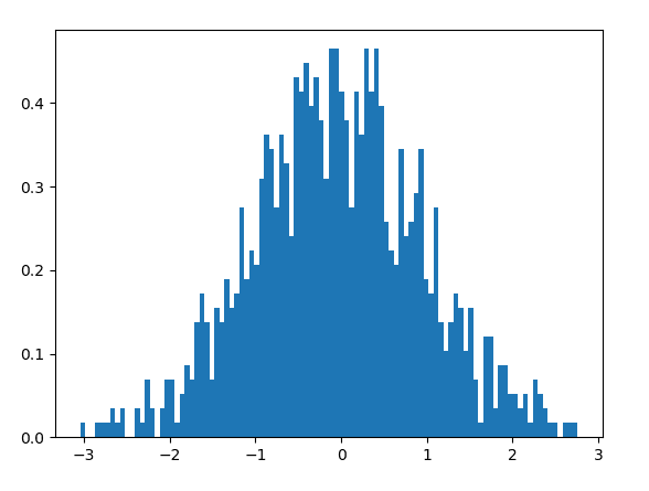
很多同学心里会有疑惑:这个图像看上去虽然是有点奇怪,虽然形状有点像正态分布,但是差得还比较多嘛,不能算是严格意义上的正态分布。
为什么会有这种情况出现呢?其实原因很简单,代码中我们设定的smapleno = 1000。这个数量并不是很大,所以整个图像看起来分布并不是很规则,只是有大致的正态分布的趋势。如果我们将这个参数加大,相当于增加样本数量,那么整个图像就会更加接近正态分布的形状。跟抛硬币的原理一致,抛的次数越多,正面与反面的出现概率更接近50%。
如果我们将sampleno设置为1000000,分布图像如下。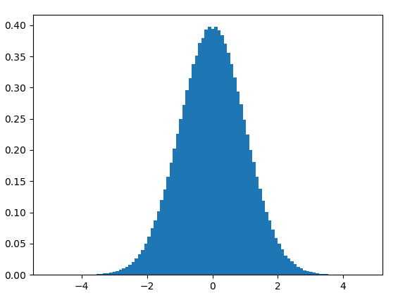
下面这个图像是不是看起来就漂亮多了!
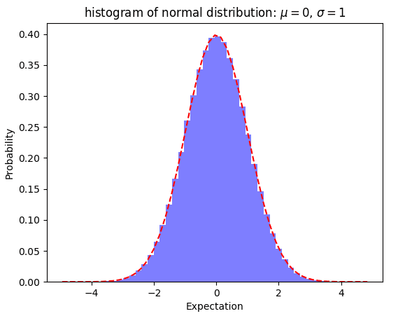
##3.画直方图与概率分布曲线
import numpy as np
import matplotlib.mlab as mlab
import matplotlib.pyplot as plt

def demo2():
    mu, sigma , num_bins = 0, 1, 50
    x = mu + sigma * np.random.randn(1000000)
    # 正态分布的数据
    n, bins, patches = plt.hist(x, num_bins, normed=True, facecolor = 'blue', alpha = 0.5)
    # 拟合曲线
    y = mlab.normpdf(bins, mu, sigma)
    plt.plot(bins, y, 'r--')
    plt.xlabel('Expectation')
    plt.ylabel('Probability')
    plt.title('histogram of normal distribution: $\mu = 0$, $\sigma=1$')

    plt.subplots_adjust(left = 0.15)
    plt.show()
最后得到的图像为: