1. 结果展示
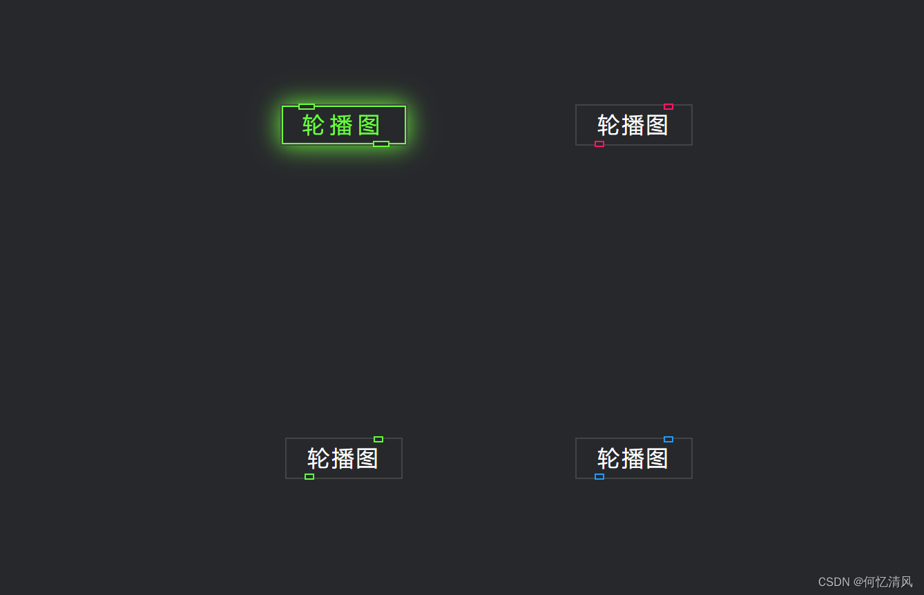
鼠标移动到Button 时会发光亮,参考视频:https://www.bilibili.com/video/BV1bg411R7j3?spm_id_from=333.1007.top_right_bar_window_custom_collection.content.click&vd_source=36b18f2d7c5333a81747c014397b7f36 我在这里修改成了vue的方式实现,演示地址:http://150.158.10.192/web
2. 代码实现
<template>
<div class="body">
<div class="router-container">
<p v-for="(p,index) in paths" :key="index">
<!-- 使用变量的方式动态取下面的值-->
<router-link class="button" :style="{'--clr':p.color}" :to="{path: p.path}"><span>{{ p.desc }}</span><i></i></router-link>
</p>
</div>
</div>
</template>
<script>
export default {
name: 'HelloWorld',
data() {
return {
paths: [
{
path: "/shuffling",
desc: '轮播图',
color: '#6eff3e'
},{
path: "/shuffling",
desc: '轮播图',
color: '#ff1867'
},{
path: "/shuffling",
desc: '轮播图',
color: '#63ff3e'
},{
path: "/shuffling",
desc: '轮播图'
,color: '#1e9bff'
},
]
}
}
}
</script>
<!-- Add "scoped" attribute to limit CSS to this component only -->
<style scoped>
* {
margin: 0;
padding: 0;
box-sizing: border-box;
font-family: 'Arial', sans-serif;
}
.body {
display: flex; /*布局*/
justify-content: center; /*水平居中*/
align-items: center; /*垂直居中*/
min-height: 100vh; /*设置最小高度*/
background: #27282c; /*设置背景颜色*/
}
.router-container {
display: flex;
flex-flow:row wrap;
width: 620px;
height: 100vh;
justify-content: space-between;
align-content: space-evenly;
gap: 20px;
}
p {
height: 100px;
width: 200px;
line-height: 100px; /*设置行高之后,text-align就可以生效,文本居中*/
background: #27282c;
text-align: center;
}
/*设置a标签的边框属性*/
a {
border: 2px solid #444;
}
.button {
position: relative;
color: #fff;
font-size: 2em;
text-decoration: none; /*设置文本为默认值, underline 可以设置下划线*/
letter-spacing: 0.1em;
padding: 10px 30px;
transition: 0.5s; /*动画时间0.5s*/
}
/*鼠标移上去时,方框发亮
实现思想:使用 .button::before 伪类元素(遮罩)创建一个内容为空,背景为黑色的方框,将button的背景颜色盖住,
通过span设置 z-index 将字显示在最上层,起到了覆盖背景颜色的功能,然后设置遮罩的 inset 元素留出部分的颜色
然后通过 box-shadow 设置阴影效果
*/
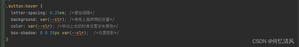
.button:hover {
letter-spacing: 0.25em; /*增加间隔*/
background: var(--clr); /*使用上面声明的变量*/
color: var(--clr); /*移动上去的时候设置字体颜色*/
box-shadow: 0 0 35px var(--clr); /*设置阴影*/
}
/*!*在button类前面插入伪类元素,相当于创建了一个透明的图层,用于显示背景颜色*!*/
.button::before {
content: '';
position: absolute;
inset: 2px; /*top right bottom left的简写,这里表示top的距离2px*/
background: #27282c;
}
.button span {
position: relative;
z-index: 1; /*设置层级关系,在button之上展示*/
}
/*-------------------------设置按钮上下的白色小标-------------------------------*/
.button i {
position: absolute;
inset: 0;
}
/*小白标*/
.button i::before {
content: '';
position: absolute;
top: -3.5px;
left: 80%;
width: 10px;
height: 5px;
border: 2px solid var(--clr);
transform: translateX(-50%);
background: #27282c;
transition: 0.5s;
}
/*鼠标移动上去时,宽度变宽一点,左右进行移动*/
.button:hover i::before {
width: 20px;
left: 20%;
}
/*下面的下白标*/
.button i::after {
content: '';
position: absolute; /*相较于父级button来进行定位*/
bottom: -3.5px;
left: 20%;
width: 10px;
height: 5px;
border: 2px solid var(--clr);
transform: translateX(-50%);
background: #27282c;
transition: 0.5s;
}
.button:hover i::after {
width: 20px;
left: 80%;
}
/*--------------------------------------------------------*/
</style>3. 总结
3.1 新属性总结
- z-index:层级,如果属性重叠了在一起,使用这个属性越大的值,就越在上面
- box-shadow:给盒子设置阴影效果
- inset:top/bottom/left/right 的简写
- gap:设置网格布局的间隔
- position:absolute(相较于最近的父元素)、relative(相较于正常的位置)
3.2 伪元素
明白了伪元素 的使用方式,可以通过创建空的伪元素 实现一些效果的展示,例如上面的遮住整个背景的发光颜色,只需要留出一点点的颜色,从而实现了边框和字体的发光
3.3 元素变量
通过vue 的特性可以实现动态的属性匹配,后续css中就可以使用var() 变量的方式进行取值,注意一定要使用“–” 连接符号表示变量,style中需要使用{ } 的方式进行取值