绘制AUC ROC 曲线 计算混淆矩阵
准确率召回率曲线,曲线下面积等是机器学习中常用来检验模型的标准,话不多说,直接上代码。
# -*- coding: utf-8 -*-"""
Created on Fri Apr 10 23:36:57 2020
@author: dell
"""import h5pyimport numpyas npimport matplotlib.pyplotas pltfrom keras.modelsimport load_modelfrom sklearnimport svm, datasetsfrom sklearn.metricsimport roc_curve, auc, confusion_matrix###计算roc和auc 混淆矩阵from sklearnimport model_selection# import mglearndefload_data():
test_data_path= r"C:\Users\dell\Desktop\data\test_data_normalized.nc"with h5py.File( test_data_path, mode='r')as f:
dest= f["test_data"]
test_data= dest[:,:-1]
test_labels= dest[:,-1]return(test_data, test_labels)(test_data, test_labels)= load_data()
test_data= np.delete(test_data,1, axis=1)# test_data = np.delete(test_data, [79, 82], axis=1)
test_data= test_data.reshape(6162,12,8,1)
eva_model= load_model(r"C:\Users\dell\Desktop\data\net_model1.h5")
eva_model_test= eva_model.evaluate(test_data, test_labels)
predictions= eva_model.predict(test_data)
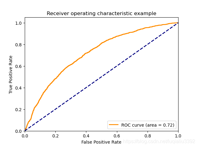
fpr,tpr,threshold= roc_curve(test_labels, predictions)###计算真正率和假正率
roc_auc= auc(fpr,tpr)###计算auc的值
plt.figure()
lw=2# plt.figure(figsize=(10,10))
plt.plot(fpr, tpr, color='darkorange',
lw=lw, label='ROC curve (area = %0.2f)'% roc_auc)###假正率为横坐标,真正率为纵坐标做曲线
plt.plot([0,1],[0,1], color='navy', lw=lw, linestyle='--')
plt.xlim([0.0,1.0])
plt.ylim([0.0,1.05])
plt.xlabel('False Positive Rate')
plt.ylabel('True Positive Rate')
plt.title('Receiver operating characteristic example')
plt.legend(loc="lower right")
plt.show()############################################################################################################################################################
pred=(predictions>0.5)# np.argmax(pred, axis=1)
confusion= confusion_matrix(test_labels, pred)# plt.figure(figsize=(5, 5))# mglearn.plots.plot_confusion_matrix_illustration(confusion)# mglearn.plots.plot_binary_confusion_matrix()下图是准确率召回率曲线,曲线越靠近右上角,则分类越好。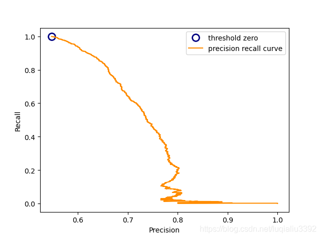
下图是曲线下面积的示例,数值大于0.8则认为模型可行。