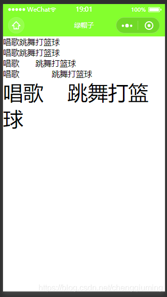
一 text组件
1 代码
<template>
<view>
<view>
<text>唱歌跳舞打篮球</text>
</view>
<view>
<text selectable>唱歌跳舞打篮球</text>
</view>
<view>
<text selectable space="ensp">唱歌 跳舞打篮球</text>
</view>
<view>
<text selectable space="emsp">唱歌 跳舞打篮球</text>
</view>
<view>
<text selectable space="nbsp" style="font-size: 40px;">唱歌 跳舞打篮球</text>
</view>
<view>&</view>
</view>
</template>
<script>
</script>
<style>
</style>
2 效果
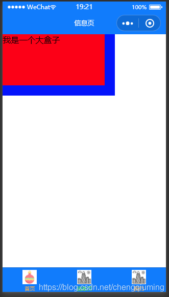
二 view组件
1 代码
<template>
    <view class="box2" hover-class="box-active2">
        <!-- hover-class:按下去的样式 -->
        <!-- hover-stop-propagation:阻止 hover-class 冒泡向外传播-->
        <!-- hover-start-time:点击后,延迟多久生效 -->
        <!-- hover-stay-time:保持效果多长时间 -->
        <view class="box" hover-class="box-active" hover-stop-propagation :hover-start-time="2000" :hover-stay-time="2000">
            我是一个大盒子
        </view>
    </view>
</template>
<script>
</script>
<style>
    .box {
        width: 200px;
        height: 100px;
        background: green;
    }
    .box-active {
        background: red;
    }
    .box2 {
        width: 220px;
        height: 120px;
        background: blue;
    }
    .box-active2 {
        background: pink;
    }
</style>
2 效果
三 button 组件
1 代码
<template>
    <view>
        <view class="box2" hover-class="box-active2">
            <!-- hover-class:按下去的样式 -->
            <!-- hover-stop-propagation:阻止 hover-class 冒泡向外传播-->
            <!-- hover-start-time:点击后,延迟多久生效 -->
            <!-- hover-stay-time:保持效果多长时间 -->
            <view class="box" hover-class="box-active" hover-stop-propagation :hover-start-time="2000" :hover-stay-time="2000">
                我是一个大盒子
            </view>
        </view>
        <button>默认按钮</button>
        <button size="mini">小按钮</button>
        <button type="primary">样式按钮</button>
        <button plain="">镂空按钮</button>
        <button disabled="">禁用按钮</button>
        <button loading>loading按钮</button>
    </view>
</template>
<script>
</script>
<style>
    .box {
        width: 200px;
        height: 100px;
        background: green;
    }
    .box-active {
        background: red;
    }
    .box2 {
        width: 220px;
        height: 120px;
        background: blue;
    }
    .box-active2 {
        background: pink;
    }
</style>
2 效果
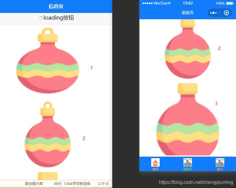
四 image 组件
1 代码
<template>
    <view>
        <view class="box2" hover-class="box-active2">
            <!-- hover-class:按下去的样式 -->
            <!-- hover-stop-propagation:阻止 hover-class 冒泡向外传播-->
            <!-- hover-start-time:点击后,延迟多久生效 -->
            <!-- hover-stay-time:保持效果多长时间 -->
            <view class="box" hover-class="box-active" hover-stop-propagation :hover-start-time="2000" :hover-stay-time="2000">
                我是一个大盒子
            </view>
        </view>
        <button>默认按钮</button>
        <button size="mini">小按钮</button>
        <button type="primary">样式按钮</button>
        <button plain="">镂空按钮</button>
        <button disabled="">禁用按钮</button>
        <button loading>loading按钮</button>
        <image src="../../static/tabs/1237644.png"></image>
        <!-- aspectFit:保持纵横比缩放图片,使图片的长边能完全显示出来。也就是说,可以完整地将图片显示出来。 -->
        <!-- aspectFill:保持纵横比缩放图片,只保证图片的短边能完全显示出来。也就是说,图片通常只在水平或垂直方向是完整的,另一个方向将会发生截取。 -->
        <image src="../../static/tabs/1237644.png" mode="aspectFit"></image>
        <image src="../../static/tabs/1237644.png" mode="aspectFill"></image>
    </view>
</template>
<script>
</script>
<style>
    .box {
        width: 200px;
        height: 100px;
        background: green;
    }


    .box-active {
        background: red;
    }


    .box2 {
        width: 220px;
        height: 120px;
        background: blue;
    }


    .box-active2 {
        background: pink;
    }
</style>
2 效果