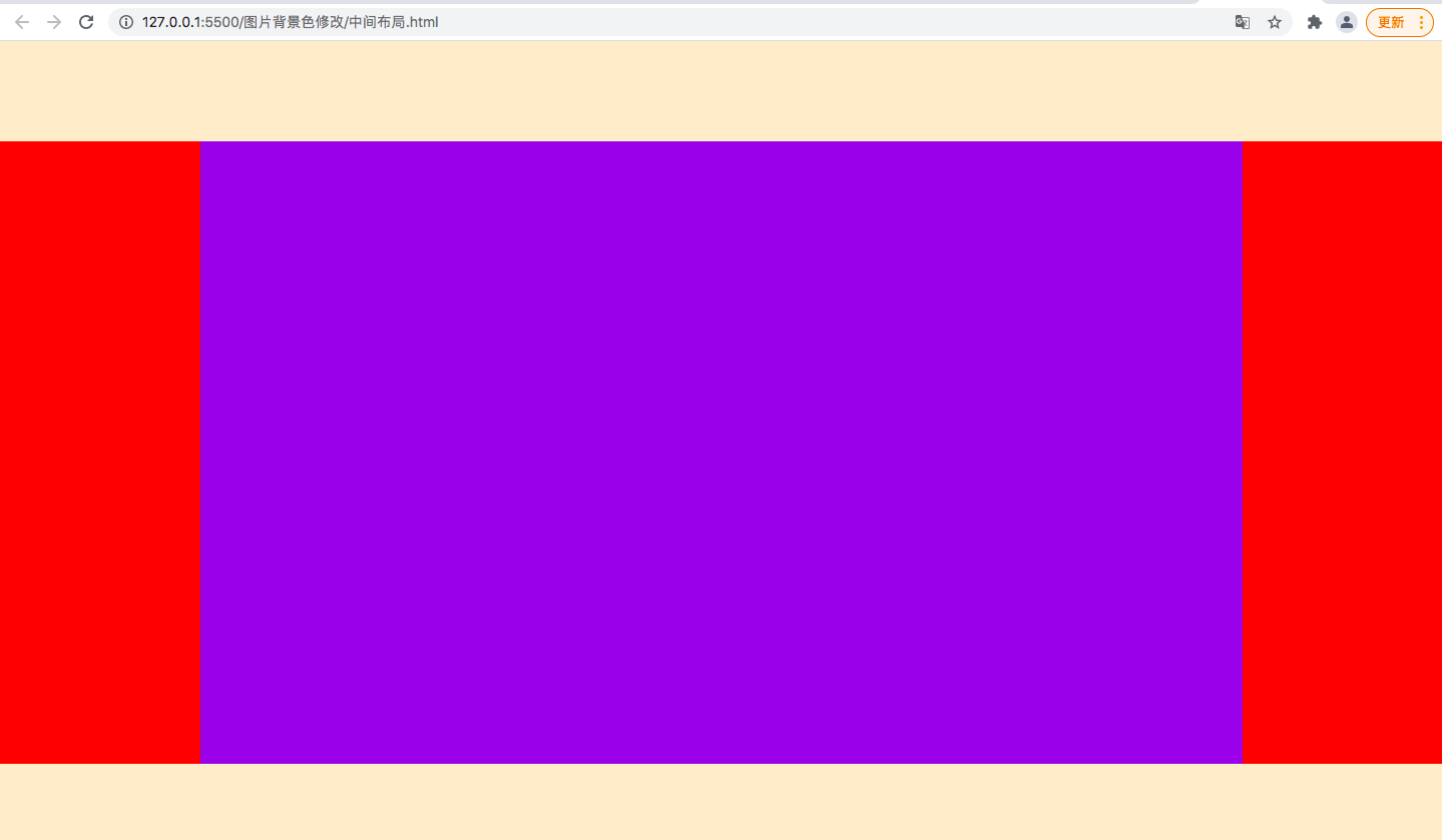
1.外部盒模型 flex ,子元素竖向排列;给顶部和底部元素 固定高度;中间元素 flex-grow: 1;
2.中间元素左右固定,中间自适应;左右元素固定宽度;中间元素flex:1
<!DOCTYPE html>

<html lang="en">

<head>
    <meta charset="UTF-8">
    <title>flex 经典布局</title>
    <style>
        html ,body{
          height: 100%;
          margin: 0;
        }
       .main {
          width: 100%;
          height: 100%;
          display: flex;
          flex-direction: column;
        }
        .content {
          flex-grow: 1;
          display: flex
        }
        .header,.footer {
        width: 100%;
        height: 100px;
        background: blanchedalmond;
        }
        .left ,.right{
            width:200px;
            height: 100%;
            background-color: #29bd63;
        }
        .center {
          flex: 1;
          background-color: #94fa1a
        }
  </style>
</head>

<body>
  <div class='main'>
    <div class='header'></div>
    <div class='content'>
      <div class='left'></div>
      <div class='center'></div>
      <div class='right'></div>
    </div>
    <div class='footer'></div>
  </div>
</body>