效果图
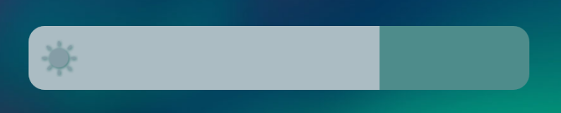
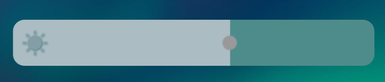
Seekbar主要是背景,滑动条,以及滑块三部分组成。
背景与滑动条在一个XML文件中。
seebar_shar.xml<?xml version="1.0" encoding="utf-8"?><layer-list xmlns:android="http://schemas.android.com/apk/res/android"><!-- 背景--><item android:id="@android:id/background"><shape><!-- 圆角--><corners android:radius="@dimen/x25"/><!-- 背景色--><solid android:color="#4E8C8B"/></shape></item><!-- 滑动条--><item android:id="@android:id/progress"><clip><shape><!-- 圆角--><corners android:radius="@dimen/x25"/><!-- 背景色--><solid android:color="#ABBCC3"/></shape></clip></item></layer-list>滑块我这里使用的是圆形滑块,在不点击时不显示。
<?xml version="1.0" encoding="utf-8"?><selector xmlns:android="http://schemas.android.com/apk/res/android"><!-- 按下状态--><item android:drawable="@drawable/thum_center" android:state_pressed="true"/><!-- 有焦点状态--><item android:drawable="@drawable/thum_center" android:state_focused="true"/><!-- 普通状态--><item android:drawable="@drawable/thum_centertm"/></selector>thum_center.png
thum_centertm.png
上面是个透明图,不想显示圆点的可以使用透明图代替。
下面是Seekbar的相关设置
<SeekBar
                    android:layout_width="match_parent"
                    android:layout_height="@dimen/x100"
                    android:maxHeight="@dimen/x100"
                    android:minHeight="@dimen/x100"
                    android:progressDrawable="@drawable/seebar_shar"
                    android:thumb="@drawable/seebar_slect"
                    android:splitTrack="false"/><!--
					 progressDrawable为滑动条的相关设置
					 thumb为滑块的设置
					 splitTrack为滑块背景色的设置
					 layout_height为布局高度
					 maxHeight与minHeight设置为布局高度即可让滑动条充满背景,类似手机音量设置效果
					 至于最左侧的亮度图标,可在RelativeLayout布局下自行设置,哪样方便哪样来-->