目录
购物车案例
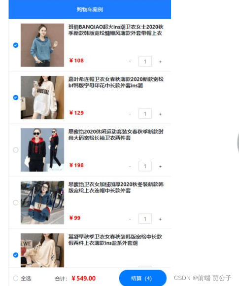
1. 案例效果
2. 实现步骤
- ① 初始化项目基本结构
- ② 封装 EsHeader 组件
- ③ 基于 axios 请求商品列表数据
- ④ 封装 EsFooter 组件
- ⑤ 封装 EsGoods 组件
- ⑥ 封装 EsCounter 组件
1.初始化项目结构
运行如下的命令,初始化 vite 项目:
npm init vite-app code-cart
cd code-cart
npm install
2. 清理项目结构:
- 把 bootstrap 相关的文件放入 src/assets 目录下
- 在 main.js 中导入 bootstrap.css
- 清空 App.vue 组件
- 删除 components 目录下的 HelloWorld.vue 组件
3. 为组件的样式启用 less 语法
npm i less -D4.初始化 index.css 全局样式如下:
:root {
 font-size: 12px;
}2.封装es-header组件
2.1创建并注册EsHeader组件
1. 在src/components/es-header/目录下新建EsHeader.vue组件:
<template>
 <div>EsHeader 组件</div>
</template> <script>
export default {
 name: 'EsHeader', }
</script> <style lang="less" scoped></style>
2. 在App.vue组件中导入并注册EsHeader.vue组件:
// 导入 header 组件
import EsHeader from './components/es-header/EsHeader.vue'
export default {
 name: 'MyApp',
 components: {
 // 注册 header 组件
 EsHeader,
 },
}
3. 在App.vue的template模板结构中使用EsHeader组件:\
<template>
 <div>
 <h1>App 根组件</h1>
 <!-- 使用 es-header 组件 -->
 <es-header></es-header>
 </div>
</template>2.2封装es-header组件
0.封装需求:
- 允许用户自定义title标题内容
- 允许用户自定义color文字颜色
- 允许用户自定义bgcolor背景颜色
- 允许用户自定义fsize字体大小
- es-header组件必须固定定位到页面顶部的位置,高度为 45px,文本居中,z-index为 999
1. 在es-header组件中封装以下的props属性:
export default {
 name: 'EsHeader',
 props: {
 title: { // 标题内容
 type: String,
 default: 'es-header',
 },
 bgcolor: { // 背景颜色
 type: String,
 default: '#007BFF',
 },
 color: { // 文字颜色
 type: String,
 default: '#ffffff',
 },
 fsize: { // 文字大小
 type: Number,
 default: 12,
 },
 },
}
2. 渲染标题内容,并动态为 DOM元素绑定行内的style样式对象:
<template>
 <div :style="{ color: color, backgroundColor: bgcolor, fontSize:
fsize + 'px' }">{{ title }}</div>
</template>
3. 为 DOM节点添加header-container类名,进一步美化es-header组件的样式:
<template>
 <div class="header-container" :style="{ color: color,
backgroundColor: bgcolor, fontSize: fsize + 'px' }">
 {{ title }}
 </div>
</template> <style lang="less" scoped>
.header-container {
 height: 45px;
 line-height: 45px;
 text-align: center;
 position: fixed;
 top: 0;
 left: 0;
 width: 100%;
 z-index: 999;
}
</style>4.在App根组件中使用es-header组件时,通过title属性指定标题内容
<template>
 <div class="app-container">
 <h1>App 根组件</h1>

 <!-- 为 es-header 组件指定 title 属性的值 -->
 <es-header title="购物车案例"></es-header>
 </div>
</template>3.基于axios请求商品列表数据
1.运行如下的命令安装axios
npm i axios-S
2.在main.js入口文件中导入并全局配置axios:
import { createApp } from 'vue'
import App from './App.vue'
import './assets/css/bootstrap.css'
import './index.css'
// 导入 axios
import axios from 'axios'
const app = createApp(App)
// 配置请求的根路径
axios.defaults.baseURL = 'https://www.escook.cn'
// 将 axios 挂载为全局的 $http 自定义属性
app.config.globalProperties.$http = axios
app.mount('#app')3.2请求商品列表数据
1. 在App.vue根组件中声明如下的data数据:
data() {
 return {
 // 商品列表的数据
 goodslist: [],
 }
},
2. 在App.vue根组件的created生命周期函数中,预调用获取商品列表数据的 methods 方法
/ 组件实例创建完毕之后的生命周期函数
created() {
 // 调用 methods 中的 getGoodsList 方法,请求商品列表的数据
 this.getGoodsList()
},3.在Ap.vue根组件的methods节点中,声明刚才预调用的getGoodsList方法:
methods: {
 // 请求商品列表的数据
 async getGoodsList() {
 // 1. 通过组件实例 this 访问到全局挂载的 $http 属性,并发起
Ajax 数据请求
 const { data: res } = await this.$http.get('/api/cart')
 // 2. 判断请求是否成功
 if (res.status !== 200) return alert('请求商品列表数据失败!')
 // 3. 将请求到的数据存储到 data 中,供页面渲染期间使用
 this.goodslist = res.list
 },
},4.封装es-footer组件
4.1创建并注册EsFooter组件
1.在src/components/es-footer/目录下新建EsFooter.vue组件:
<template>
 <div>EsFooter 组件</div>
</template> <script>
export default {
 name: 'EsFooter', }
</script> <style lang="less" scoped></style>
2. 在App.vue组件中导入并注册EsFooter.vue组件:
// 导入 header 组件
import EsHeader from './components/es-header/EsHeader.vue'
// 导入 footer 组件
import EsFooter from './components/es-footer/EsFooter.vue'
export default {
 name: 'MyApp',
 components: {
 // 注册 header 组件
 EsHeader,
 // 注册 footer 组件
 EsFooter,
 },
} 63.在App.vue的template模板结构中使用EsFooter组件:
<template>
 <div>
 <h1>App 根组件</h1>
 <!-- 使用 es-header 组件 -->
 <es-header></es-header>
 <!-- 使用 es-footer 组件 -->
 <es-footer></es-footer>
 </div>
</template>4.2封装es-footer组件
- es-footer组件必须固定定位到页面底部的位置高度为 50px内容两端贴边对齐z-index :999
- 允许用户自定义amount总价格(单位是元),并在渲染时保留两位小数
- 允许用户自定义total总数量 并渲染到结算按钮中 如果要结算的商品数为0则禁用结算按钮
- 允许用户自定义isfull全选按钮的选中状态
- 允许用户通过自定义事件的形式,监听全选按钮选中状态的变化并获取到最新的选中状态
<!-- Footer 组件 -->
<my-footer :isfull="false" :total="1" :amount="98"
@fullChange="onFullStateChange"></my-footer>4.2.1渲染组件的基础布局
1. 将EsFooter.vue组件在页面底部进行固定定位
<template>
 <div class="footer-container">EsFooter 组件</div>
</template> <script>
export default {
 name: 'EsFooter', }
</script> <style lang="less" scoped>
.footer-container {
 // 设置宽度和高度
 height: 50px;
 width: 100%;
 // 设置背景颜色和顶边框颜色
 background-color: white;
 border-top: 1px solid #efefef;
 // 底部固定定位
 position: fixed;
 bottom: 0;
 left: 0;
 // 内部元素的对齐方式
 display: flex;
 justify-content: space-between;
 align-items: center;
 // 设置左右 padding
 padding: 0 10px; }
</style>
2. 根据 bootstrap提供的Checkboxeshttps://v4.bootcss.com/docs/components/forms/#check
boxes渲染左侧的全选按钮:
<template>
 <div class="footer-container">
 <!-- 全选按钮 -->
 <div class="custom-control custom-checkbox">
 <input type="checkbox" class="custom-control-input"
id="fullCheck" />
 <label class="custom-control-label" for="fullCheck">全选
</label>
 </div>
 </div>
</template>并在全局样式表index.css中覆盖全选按钮的圆角样式:
.custom-checkbox .custom-control-label::before {
border-radius: 10px; }3.渲染合计对应的价格区域:
<template>
 <div class="footer-container">
 <!-- 全选按钮 -->
 <div class="custom-control custom-checkbox">
 <input type="checkbox" class="custom-control-input"
id="fullCheck" />
 <label class="custom-control-label" for="fullCheck">全选
</label>
 </div>
 <!-- 合计 -->
 <div>
 <span>合计:</span>
 <span class="amount">¥0.00</span>
 </div>
 </div>
</template>并在当前组件的<style>节点中美化总价格的样式
.amount {
 color: red;
font-weight: bold; }4.根据bootstrap 提供的渲染结算按钮:
Buttonshttps://v4.bootcss.com/docs/components/buttons/#examples
<template>
 <div class="footer-container">
 <!-- 全选按钮 -->
 <div class="custom-control custom-checkbox">
 <input type="checkbox" class="custom-control-input"
id="fullCheck" />
 <label class="custom-control-label" for="fullCheck">全选
</label>
 </div>
 <!-- 合计 -->
 <div>
 <span>合计:</span>
 <span class="amount">¥0.00</span>
 </div>
 <!-- 结算按钮 -->
 <button type="button" class="btn btn-primary">结算(0)</button>
 </div>
</template>并在当前组件的<style>节点中美化结算按钮的样式
.btn-primary {
 // 设置固定高度
 height: 38px;
 // 设置圆角效果
 border-radius: 19px;
 // 设置最小宽度
min-width: 90px; }4.2.2封装自定义属性amount
amount是已勾选商品的总价格
1. 在EsFooter.vue组件的props节点中,声明如下的自定义属性
export default {
 name: 'EsFooter',
 props: {
 // 已勾选商品的总价格
 amount: {
 type: Number,
 default: 0,
 },
 },
}
2. 在EsFooter.vue组件的DOM结构中渲染amount的值:
<!-- 合计 -->
<div>
 <span>合计:</span>
 <!-- 将 amount 的值保留两位小数 -->
 <span class="amount">¥{{ amount.toFixed(2) }}</span>
</div>4.2.3封装自定义属性total
total为已勾选商品的总数量
1.在EsFooter.vue组件的props节点中,声明如下的自定义属性
export default {
 name: 'EsFooter',
 props: {
 // 已勾选商品的总价格
 amount: {
 type: Number,
 default: 0,
 },
 // 已勾选商品的总数量
 total: {
 type: Number,
 default: 0,
 },
 },
}
2. 在EsFooter.vue组件的DOM结构中渲染total的值
<!-- 结算按钮 -->
<button type="button" class="btn btn-primary">结算({{total}})
</button>
3. 动态控制结算按钮的禁用状态:
<!-- disabled 的值为 true,表示禁用按钮 -->
<button type="button" class="btn btn-primary" :disabled="total ===
0">结算({{ total }})</button>4.2.4封装自定义属性isfull
isfull是全选按钮的选中状态,true表示选中,false表示未选中
1.在EsFooter.vue组件的props节点中,声明如下的自定义属性:
export default {
 name: 'EsFooter',
 props: {
 // 已勾选商品的总价格
 amount: {
 type: Number,
 default: 0,
 },
 // 已勾选商品的总数量
 total: {
 type: Number,
 default: 0,
 },
 // 全选按钮的选中状态
 isfull: {
 type: Boolean,
 default: false,
 },
 },
}2.为复选框动态绑定ckecked属性的值:
<!-- 全选按钮 -->
<div class="custom-control custom-checkbox">
 <input type="checkbox" class="custom-control-input"
id="fullCheck" :checked="isfull" />
 <label class="custom-control-label" for="fullCheck">全选</label>
</div>4.2.5封装自定义事件fullChange
通过自定义事件fullChange,把最新的选中状态传递给组件的使用者
1. 监听复选框选中状态变化的change事件:
<!-- 全选按钮 -->
<div class="custom-control custom-checkbox">
 <input type="checkbox" class="custom-control-input"
id="fullCheck" :checked="isfull" @change="onCheckBoxChange" />
 <label class="custom-control-label" for="fullCheck">全选</label>
</div>
2. 在methods中声明onCheckBoxChange,并通过事件对象e获取到最新的选中状态:
methods: {
 // 监听复选框选中状态的变化
 onCheckBoxChange(e) {
 // e.target.checked 是复选框最新的选中状态
 console.log(e.target.checked)
 },
},
3. 在emits中声明自定义事件:
// 声明自定义事件
emits: ['fullChange'],在onCheckBoxChange事件处理函数中,通过$emit()触发自定义事件,把最新的选中
状态传递给当前组件的使用者:
methods: {
 onCheckBoxChange(e) {
 // 触发自定义事件
 this.$emit('fullChange', e.target.checked)
 },
},5.在App.vue根组件中测试EsFooter.vue组件:
<!-- 使用 footer 组件 -->
<es-footer :total="0" :amount="0" @fullChange="onFullStateChange">
</es-footer>并在methods中声明onFullStateChange处理函数,通过形参获取到全选按钮最新的
选中状态:
methods: {
 // 监听全选按钮状态的变化
 onFullStateChange(isFull) {
 // 打印全选按钮最新的选中状态
 console.log(isFull)
 },
},5.封装es-goods组件
5.1创建并注册EsGoods组件
1.在src/components/es-goods/目录下新建EsGoods.vue组件:
<template>
 <div>EsGoods 组件</div>
</template> <script>
export default {
 name: 'EsGoods', }
</script> <style lang="less" scoped></style>
2. 在App.vue组件中导入并注册EsGoods.vue组件:
// 导入 header 组件
import EsHeader from './components/es-header/EsHeader.vue'
// 导入 footer 组件
import EsFooter from './components/es-footer/EsFooter.vue'
// 导入 goods 组件
import EsGoods from './components/es-goods/EsGoods.vue'
export default {
 name: 'MyApp',
 components: {
 // 注册 header 组件
 EsHeader,
 // 注册 footer 组件
 EsFooter,
 // 注册 goods 组件
 EsGoods,
 },
}
3. 在App.vue的template模板结构中使用EsGoods组件
<template>
 <div class="app-container">
 <!-- 使用 header 组件 -->
 <es-header title="购物车案例"></es-header>
 <!-- 使用 goods 组件 -->
 <es-goods></es-goods>
 <!-- 使用 footer 组件 -->
 <es-footer :total="0" :amount="0"
@fullChange="onFullStateChange"></es-footer>
 </div>
</template>5.2封装es-goods组件
5.2.0封装需求
- 1. 实现EsGoods组件的基础布局
- 2. 封装组件的 6个自定义属性(id, thumb,title,price,count,checked)
- 3. 封装组件的自定义事件stateChange,允许外界监听组件选中状态的变
<!-- 使用 goods 组件 -->
<es-goods
 v-for="item in goodslist"
 :key="item.id"
 :id="item.id"
 :thumb="item.goods_img"
 :title="item.goods_name"
 :price="item.goods_price"
 :count="item.goods_count"
 :checked="item.goods_state"
 @stateChange="onGoodsStateChange"
></es-goods>5.2.1渲染组件的基础布局
1. 渲染EsGoods组件的基础DOM结构:
<template>
  <div class="goods-container">
    <!-- 左侧图片区域 -->
    <div class="left">
      <!-- 商品的缩略图 -->
      <img src="" alt="商品图片" class="thumb" />
    </div>
    <!-- 右侧信息区域 -->
    <div class="right">
      <!-- 商品名称 -->
      <div class="top">xxxx</div>
      <div class="bottom">
        <!-- 商品价格 -->
        <div class="price">¥0.00</div>
        <!-- 商品数量 -->
        <div class="count">数量</div>
      </div>
    </div>
  </div>
</template>
2. 美化组件的布局样式
.goods-container {
  display: flex;
  padding: 50px,10px;
  // 左侧图片的样式
  .left {
    margin-right: 10px;
    // 商品图片
    .thumb {
      display: block;
      width: 100px;
      height: 100px;
      background-color: #efefef;
    }
  }
  // 右侧商品名称、单价、数量的样式
  .right {
    display: flex;
    flex-direction: column;
    justify-content: space-between;
    flex: 1;
    .top {
      font-weight: bold;
    }
    .bottom {
      display: flex;
      justify-content: space-between;
      align-items: center;
      .price {
        color: red;
        font-weight: bold;
      }
    }
  }
}在商品缩略图之外包裹复选框(https://v4.bootcss.com/docs/components/forms/#checkboxes)
<!-- 左侧图片和复选框区域 -->
<div class="left">
 <!-- 复选框 -->
 <div class="custom-control custom-checkbox">
 <input type="checkbox" class="custom-control-input"
id="customCheck1" />
 <!-- 将商品图片包裹于 label 之中,点击图片可以切换“复选框”的选
中状态 -->
 <label class="custom-control-label" for="customCheck1">
 <img src="" alt="商品图片" class="thumb" />
 </label>
 </div>
 <!-- <img src="" alt="商品图片" class="thumb" /> -->
</div>4.覆盖复选框的默认样式:
.custom-control-label::before,
.custom-control-label::after {
 top: 3.4rem; }
5. 在App.vue组件中循环渲染EsGoods.vue组件
<!-- 使用 goods 组件 -->
<es-goods v-for="item in goodslist" :key="item.id"></es-goods> 12
6. 为EsGoods.vue添加顶边框:
.goods-container {
 display: flex;
 padding: 10px;
 // 最终生成的选择器为 .goods-container + .goods-container
 // 在 css 中,(+)是“相邻兄弟选择器”,表示:选择紧连着另一元素后
的元素,二者具有相同的父元素。
 + .goods-container {
 border-top: 1px solid #efefef;
 }
 // ...省略其他样式
}5.2.2封装自定义属性id
id是每件商品的唯一标识符
1. 在EsGoods.vue组件的props节点中,声明如下的自定义属性:
export default {
 name: 'EsGoods',
 props: {
 // 唯一的 key 值
 id: {
 type: [String, Number], // id 的值可以是“字符串”也可以是“数 值”
 required: true,
 },
 },
}
2. 在渲染复选框时动态绑定input的id属性和label的for属性值
<!-- 复选框 -->
<div class="custom-control custom-checkbox">
 <input type="checkbox" class="custom-control-input" :id="id" />
 <label class="custom-control-label" :for="id">
 <img src="" alt="商品图片" class="thumb" />
 </label>
</div>3.在App.vue中使用EsGoods.vue组件时,动态绑定id属性的值:
<!-- 使用 goods 组件 -->
<es-goods v-for="item in goodslist" :id="item.id"></es-goods> 125.2.3封装其它属性
除了id属性之外,EsGoods组件还需要封装:
缩略图(thumb)、商品名称(title)、单价(price)、数量(count)、勾选状态
(checked)这5个属性
1.在EsGoods.vue组件的props节点中,声明如下的自定义属性:
export default {
 name: 'EsGoods',
 props: {
 // 唯一的 key 值
 id: {
 type: [String, Number],
 required: true,
 },
 // 1. 商品的缩略图
 thumb: {
 type: String,
 required: true,
 },
 // 2. 商品的名称
 title: {
 type: String,
 required: true,
 },
 // 3. 单价
 price: {
type: Number,
 required: true,
 },
 // 4. 数量
 count: {
 type: Number,
 required: true,
 },
 // 5. 商品的勾选状态
 checked: {
 type: Boolean,
 required: true,
 },
 },
}2.在EsGoods.vue组件的DOM结构中渲染商品的信息数据:
<template>
 <div class="goods-container">
 <!-- 左侧图片和复选框区域 -->
 <div class="left">
 <!-- 复选框 -->
 <div class="custom-control custom-checkbox">
 <input type="checkbox" class="custom-control-input"
:id="id" :checked="checked" />
 <label class="custom-control-label" :for="id">
 <img :src="thumb" alt="商品图片" class="thumb" />
 </label>
 </div>
 </div>
 <!-- 右侧信息区域 -->
 <div class="right">
 <!-- 商品名称 -->
 <div class="top">{{ title }}</div>
 <div class="bottom">
 <!-- 商品价格 -->
 <div class="price">¥{{ price.toFixed(2) }}</div>
 <!-- 商品数量 -->
 <div class="count">数量:{{ count }}</div>
 </div>
 </div>
 </div>
</template>
在